Statements Blog
Inspire. design. repeat.
Read all the up to date information about our newest tile collections, tile facts, customer projects and so much more.

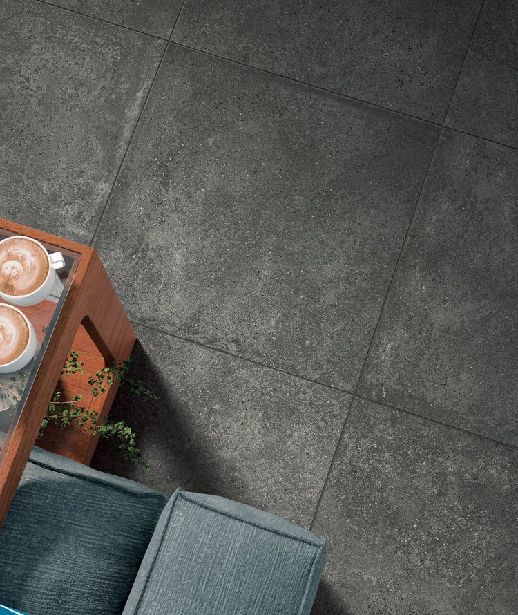
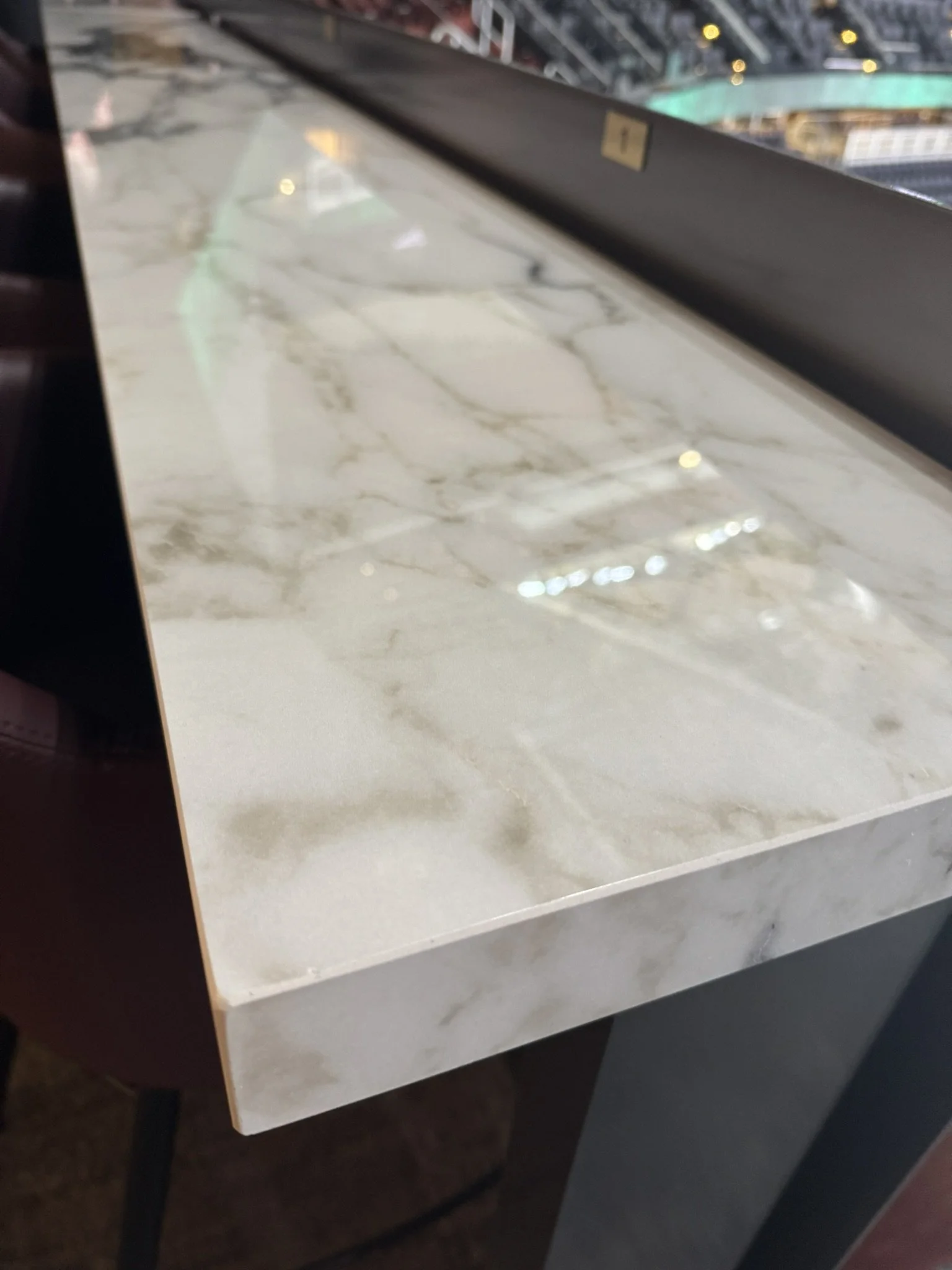
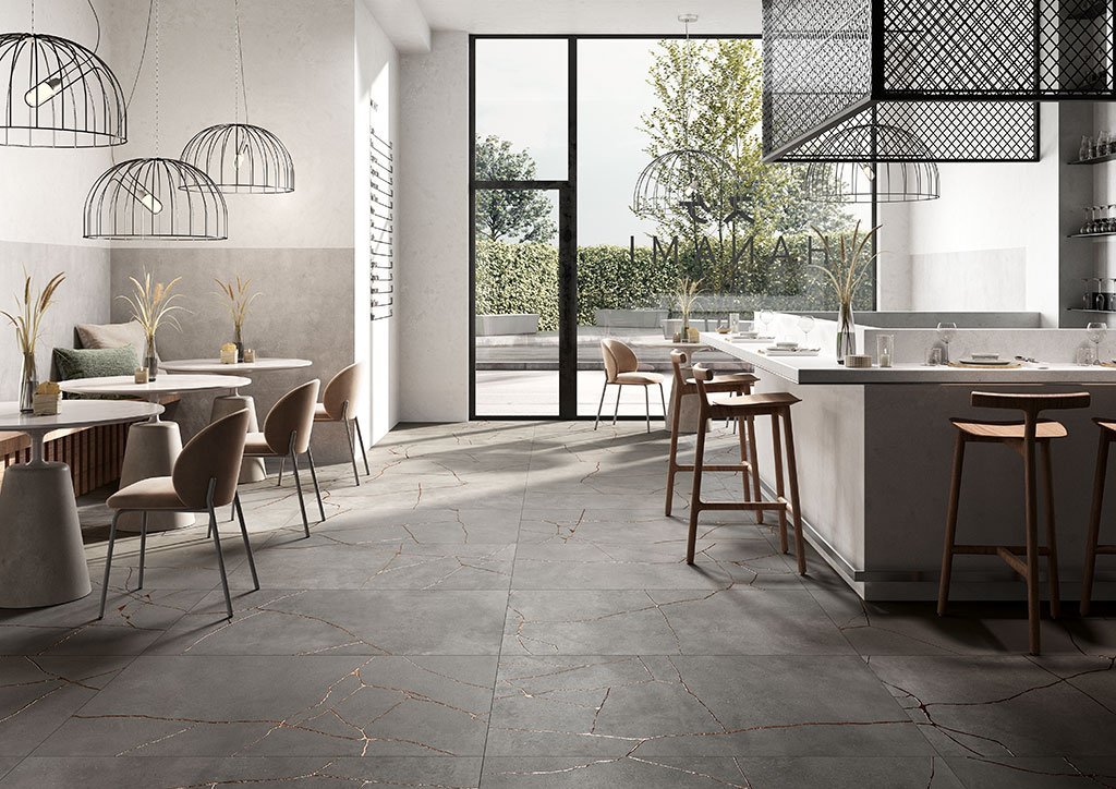
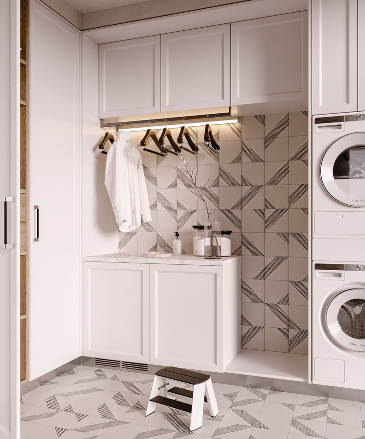
Porcelain Slabs That Stand the Test of Time: A Showcase at Climate Pledge Arena
When selecting a surface material—whether for a busy commercial project or a dream home—durability and beauty are often at the top of the list. Porcelain slabs check both boxes, offering a unique balance of performance and style that works just as well in an arena with millions of visitors as it does in a family kitchen.
When selecting a surface material—whether for a busy commercial project or a dream home—durability and beauty are often at the top of the list. Porcelain slabs check both boxes, offering a unique balance of performance and style that works just as well in an arena with millions of visitors as it does in a family kitchen.
And if you’ve ever wondered whether porcelain truly delivers on its promises, we’ve got proof: over 600 porcelain slabs installed at Seattle’s Climate Pledge Arena. Several years later, they still look incredible.

Tested in the Real World
Climate Pledge Arena isn’t your average building. It’s a landmark entertainment venue that hosts NHL games, major concerts, and events drawing thousands of visitors every week. High traffic, constant cleaning, and everyday wear and tear make it the ultimate testing ground for surface materials.
Porcelain slabs have risen to the challenge:
Scratch & Stain Resistance: Ideal for areas that see everything from hockey skates to spilled concessions.
Durability Under Pressure: Large crowds and rolling equipment haven’t compromised the finish or integrity of the slabs.
Easy Maintenance: A quick clean keeps surfaces looking fresh—essential for a venue that operates almost nonstop.
What That Means for Your Projects
The same qualities that make porcelain slabs perfect for a demanding commercial space also make them an excellent choice for residential applications:
For Homeowners: Imagine a countertop that resists spills, a floor that doesn’t scratch easily, or a shower wall that looks luxurious without the upkeep.
For Designers & Builders: Think of the versatility—slabs that mimic marble, wood, or concrete but with none of the porosity or maintenance challenges.


A Material That’s Proven Itself
Porcelain slabs at Climate Pledge Arena have endured years of heavy use and still look amazing. For us, it’s a living case study that proves porcelain is more than just a beautiful material—it’s an investment in longevity, function, and design freedom.
So the next time you’re at Climate Pledge Arena for a Kraken game, a concert, or another event, take a moment to notice the surfaces around you. Those are porcelain slabs—quietly doing their job, beautifully and reliably.
If porcelain can handle the daily demands of one of the busiest arenas in the country, just imagine what it can do in your next project.

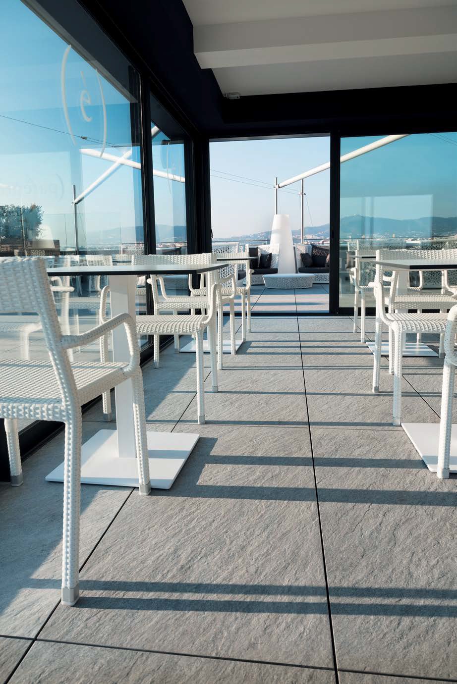
Porcelain Facades: Beauty Meets Durability
Elevate your exterior design with high-performance ventilated facade systems.
Innovative Facades.
Sustainable Excellence.
Elevate your exterior design with high-performance ventilated facade systems. At Statements Tile, we work closely with the factory’s engineering team to develop customized cladding solutions that combine aesthetic impact with technical precision. Backed by the factory’s engineering expertise and decades of global facade experience, together, we help you create facades that are as functional as they are inspiring.

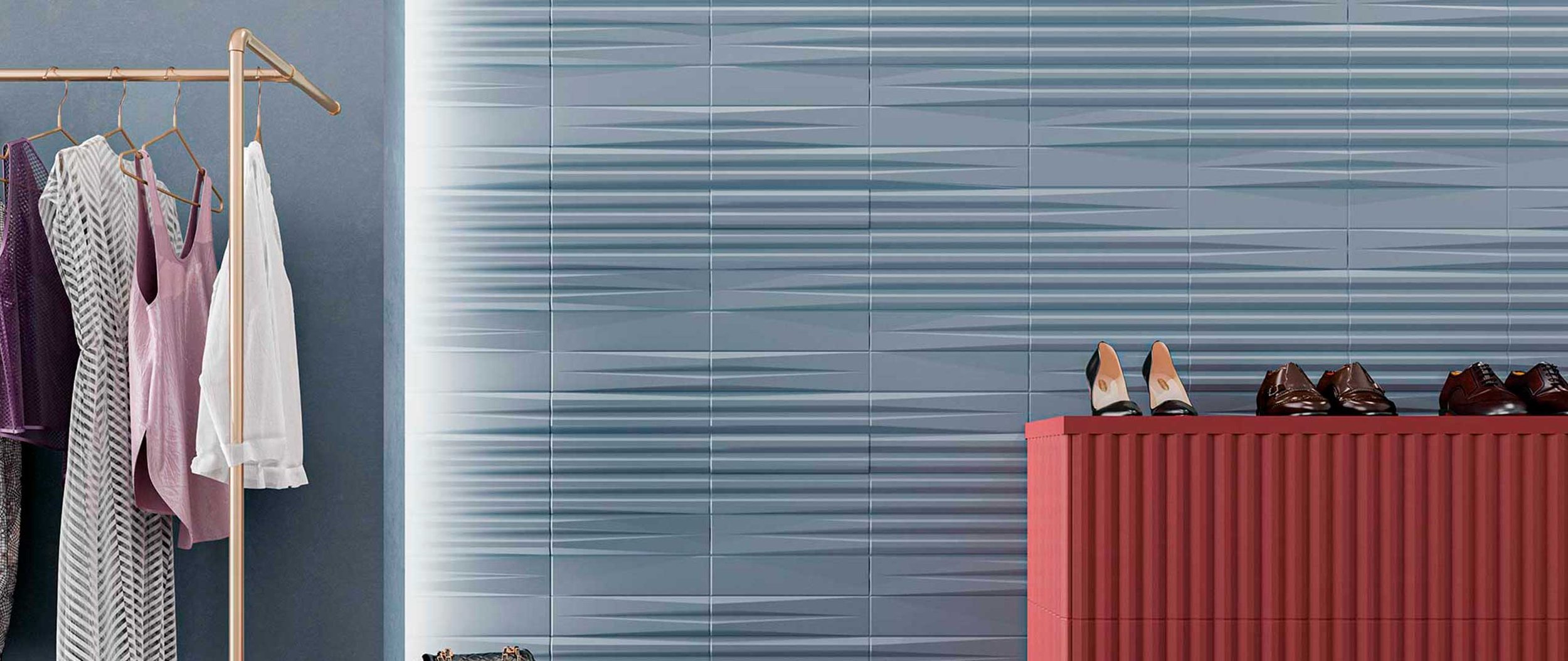
VEntilated vs Glued Facades
Ventilated facades feature an advanced cladding system that includes an air gap between the outer cladding panels and the building’s insulating layer. This cavity allows for natural airflow, which helps regulate temperature, enhances thermal insulation, and reduces moisture buildup. The continuous ventilation creates a "chimney effect," expelling heat and humidity, which contributes to better energy efficiency and indoor comfort. Ventilated facades are especially beneficial in climates with wide temperature fluctuations or high humidity.
Glued facades, on the other hand, involve attaching cladding panels directly to the structural wall using high-performance adhesives. This method offers a sleek, modern appearance with no visible mechanical fixings. In addition to clean aesthetics, glued facades provide excellent resistance to weather, flexible design options across a wide range of materials and finishes, and improved energy efficiency. The adhesive bond also protects the building envelope by preventing moisture infiltration and contributing to a more stable indoor climate

Ventilated Facade

Glued Facade
Benefits of BOTH Porcelain Facades Systems

Durability and Weather Resistance
Both systems utilize porcelain stoneware, a material known for its remarkable strength and resilience. It offers superior resistance to extreme weather conditions, including UV rays, freeze-thaw cycles, humidity, and pollution. This ensures that the facade maintains its structural integrity and visual appeal for decades, even in the most challenging environments, with very little need for ongoing maintenance.

Aesthetic Versatility
Whether opting for a ventilated or glued solution, architects and designers can choose from an extensive palette of colors, textures, and formats. Porcelain panels are inspired by a wide range of natural and architectural materials—such as concrete, marble, wood, and stone—allowing for seamless integration into any design style, from contemporary to classic. Large-format slabs and custom cuts further expand creative possibilities.

Energy Efficiency
Both facade systems contribute to the overall energy efficiency of the building. They help to regulate internal temperatures by minimizing thermal bridging and enhancing insulation. This results in reduced reliance on heating and cooling systems, lowering energy consumption and operating costs throughout the building's life.

Structural Protection
By creating a barrier between the exterior environment and the structural wall, these systems protect the building against moisture infiltration, surface degradation, and temperature-related stress. This layer of protection extends the life of the underlying structure and reduces the risk of long-term damage or costly repairs.

Enhanced Living Comfort
Both systems help to create more comfortable and stable indoor environments by moderating temperature swings and preventing issues like condensation or humidity buildup. This leads to improved occupant comfort and supports healthier living and working spaces, especially in buildings with high environmental demands.
Want more information?
Contact us to learn more about how our facade solutions can support your next project.

Big Style, Small Price Tag: Introducing the Advantage Collection
We’re excited to announce the launch of our Advantage Collection — a brand-new, privately curated line of porcelain tile that brings together exceptional design, incredible value, and the quality you expect from Statements.

We’re excited to announce the launch of our Advantage Collection — a brand-new, privately curated line of porcelain tile that brings together exceptional design, incredible value, and the quality you expect from Statements.
This collection marks a first for us: our very own private offering, thoughtfully developed to support a wide range of projects with standout style and reliable availability. Whether you're working on a large-scale commercial build or a high-impact residential refresh, Advantage is designed to deliver — quickly, beautifully, and affordably.
Why Choose Advantage?
Flat Rate Pricing
Every tile in the Advantage Collection is a 12x24" premium porcelain — and each one retails at just $5 per square foot. That’s right: timeless, design-forward tile at an accessible price point, so you can stay on budget without sacrificing on style.
Fast Lead Times
All colors are stocked in Seattle for fast local pickup or delivery. Plus, with additional inventory stocked in the U.S., even large orders (10,000+ square feet) can typically ship within about a week. That means less waiting and more doing.
Versatile Design Options
The Advantage Collection features a range of looks to suit any aesthetic. Choose from the classic elegance of marble, the rugged character of antique stone, or the organic texture of volcanic rock. Whatever your vision, Advantage offers a surface that fits — and enhances — your space.
Design Smarter, Build Faster, Save More


Whether you're outfitting a commercial lobby, renovating a cozy kitchen, or sourcing tile for a multi-family development, Advantage gives you the flexibility, quality, and pricing you need — without compromise.
Ready to see it in person? Looking for samples or support? Get in touch — we’re here to help you bring your project to life.

Newest Collections at Statements
Over the past few months, we’ve been busy curating a fresh lineup of tile collections, and we’re excited to share them with you! From striking marble-inspired designs to playful kit-kat mosaics and everything in between, there’s something new for every style, surface, and space.
Over the past few months, we’ve been busy curating a fresh lineup of tile collections, and we’re excited to share them with you! From striking marble-inspired designs to playful kit-kat mosaics and everything in between, there’s something new for every style, surface, and space. Whether you're planning a full renovation or just looking to spark some inspiration, our latest arrivals are packed with personality, texture, and timeless appeal. Keep reading to discover all the newest collections now available at Statements.

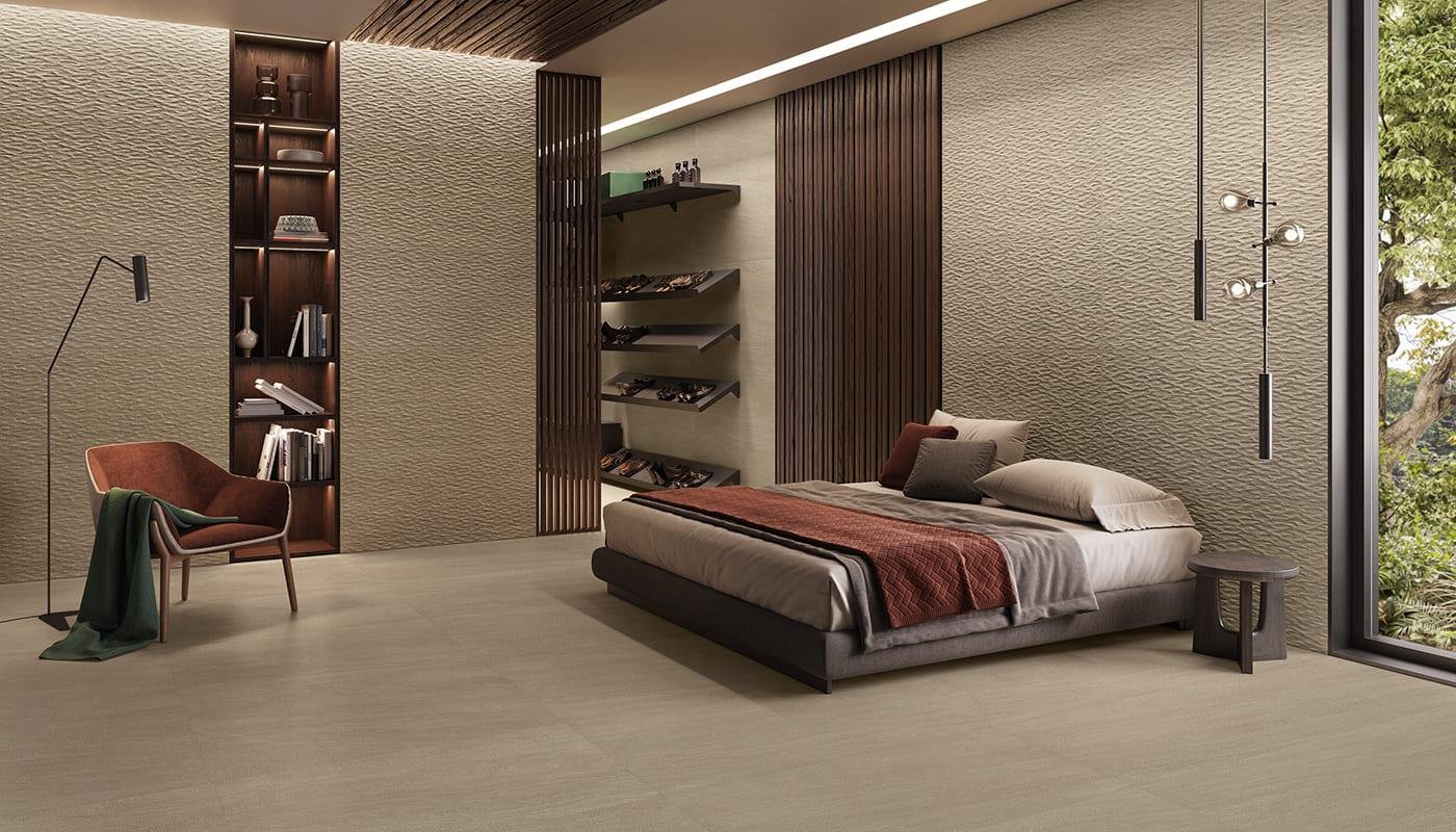
ARAN
Inspired by the refined beauty of Pietra Grey, a distinguished Iranian marble, the Aran collection captures the essence of sophistication. Its rich tonal variations and luxurious depth make it a versatile choice, seamlessly complementing both classic interiors and modern spaces. Whether paired with steel and concrete for an urban aesthetic or integrated into traditional designs, Aran delivers enduring elegance in a durable porcelain format.

AURA
Boasting a high-gloss finish and exceptional graphic precision, this series brings a new level of sophistication to any interior. The lustrous, reflective surface not only amplifies light but also adds a sense of depth and dimension, making spaces feel more open and dynamic. Each tile showcases intricate details and refined patterns, achieved through cutting-edge digital technology that beautifully mimics the look of high-end materials. Whether used as a statement wall, a luxurious backsplash, or a modern floor application, this collection effortlessly blends artistic expression with technical innovation to create a sleek, contemporary, and inviting atmosphere.

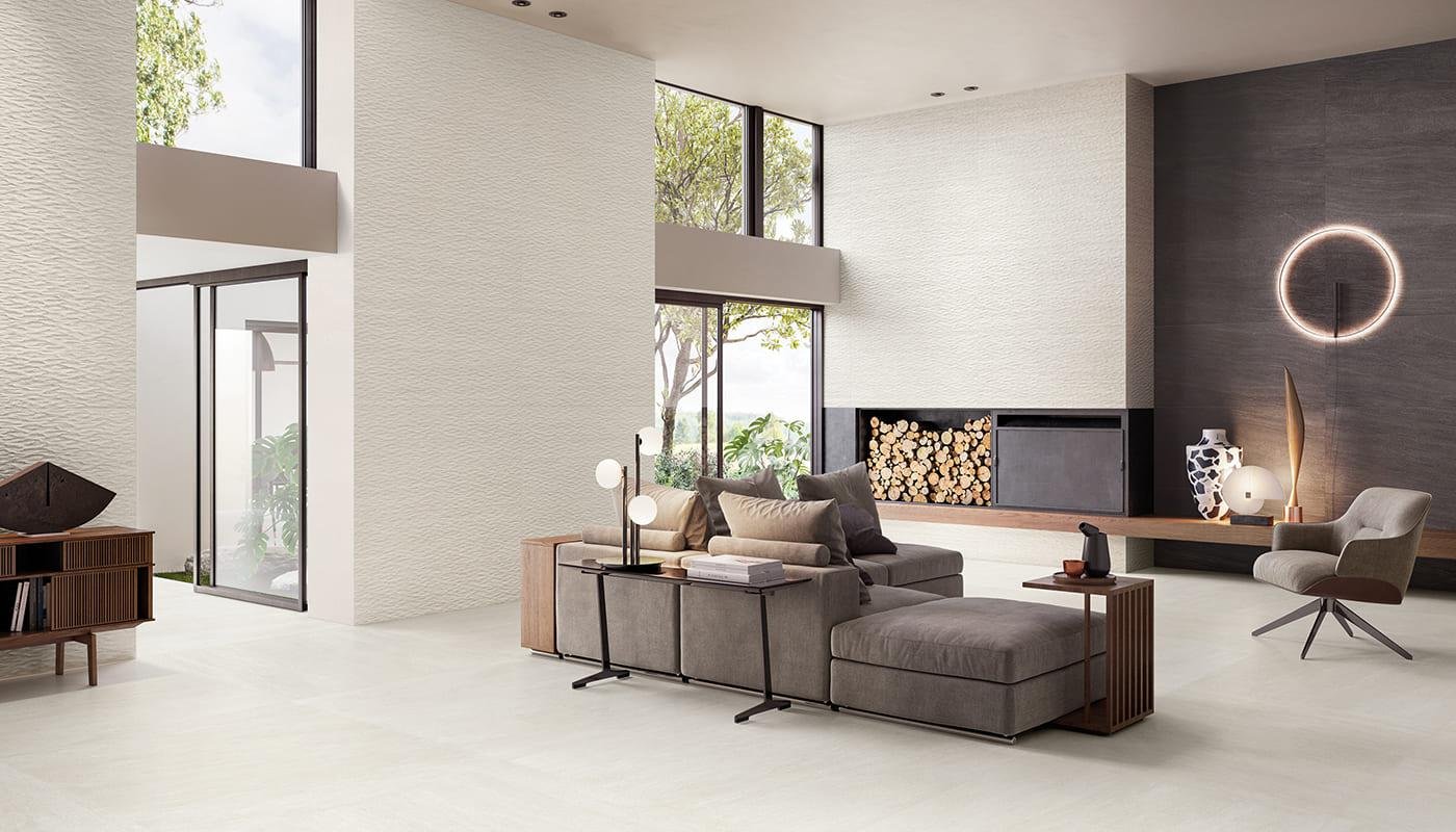
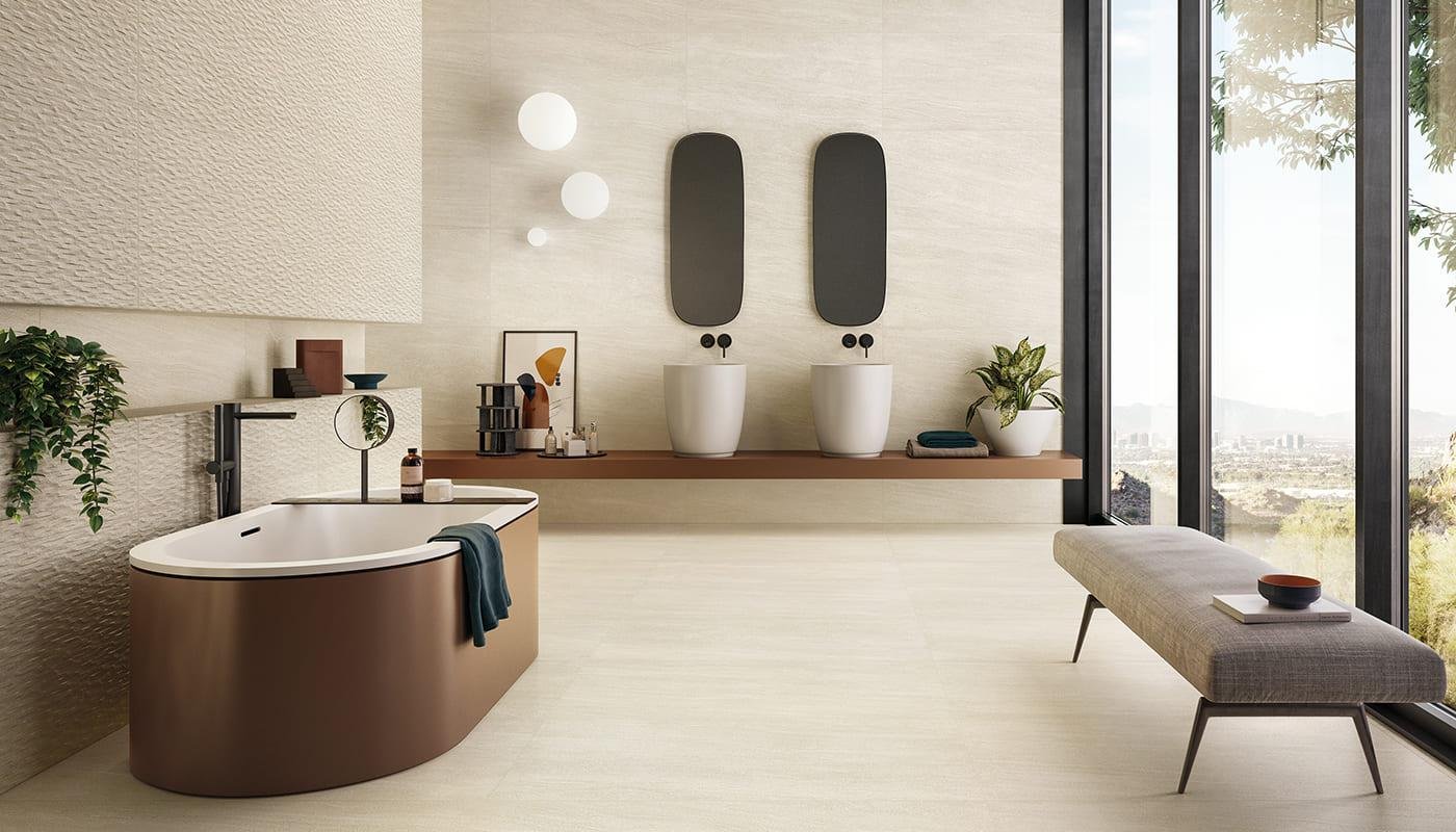
Carve
Add depth, texture, and undeniable character to your spaces with our Carve series—a collection that transforms surfaces into sculptural statements. Featuring a soft, carved finish that subtly plays with light and shadow, each tile evokes the look and feel of hand-crafted artistry. The steel-toned color palette brings a refined industrial edge, while the intricate surface detailing adds dimension and visual interest without overwhelming the space. Reminiscent of a modern art piece, Carve is ideal for creating feature walls, accent areas, or refined interiors that demand a touch of texture and a lot of personality. Perfect for both residential and commercial applications, this series brings elevated design to any project.

Class
Class embodies sophistication, drawing inspiration from the pure beauty of marble. Its refined design features delicate earth-toned veining that gracefully contrasts against a creamy backdrop, creating a stunning visual effect that enhances any space. With two exquisite finishes and a warm color palette, this collection offers both subtlety and impact, making it the perfect choice for elegant and timeless interiors.

Cortina
With subtle veining that feels like memories gently etched in stone, this collection captures the essence of quiet beauty and enduring elegance. Inspired by nature’s artistry, each surface tells a story—where every delicate line adds depth, dimension, and a sense of timelessness. The soft, organic patterns evoke a feeling of calm and purity, reminiscent of untouched landscapes and the clean, graceful lines found in the most refined natural materials. This isn’t just a surface—it’s a canvas of emotion and history, inviting warmth and sophistication into any space. Ideal for those who seek to surround themselves with pieces that balance artistry and authenticity, this collection brings a serene yet striking presence to both modern and traditional environments alike.

Kit-Kat
The Kit-Kat collection offers a playful yet refined take on the classic finger tile, reimagined in a vibrant palette of fresh, bright colors that instantly energize any space. Its signature convex shape and soft relief surface interact beautifully with light, creating captivating sparkles and dynamic plays of light and shadow throughout the day. This subtle movement adds a sense of depth and texture, bringing surfaces to life with an artful, tactile quality.
Perfectly suited for compact areas where you want to make a big impression, Kit-Kat tiles are ideal for decorative indoor or outdoor applications. Whether you're designing a cozy powder room, a stylish kitchen backsplash, or adding character to commercial spaces like bar fronts, counters, shelving nooks, or architectural columns, this versatile tile delivers a bold visual impact in a compact format. With its sleek silhouette and radiant color options, Kit-Kat is a standout choice for those who value both contemporary design and timeless charm.

Magnolia
Magnolia is a celebration of femininity, tradition, and timeless sophistication. This elegant collection brings a soft, handcrafted aesthetic to contemporary spaces. Its refined character lies in the perfect balance between delicate detailing and a slightly rustic finish, offering a design language that feels both nostalgic and fresh.
The collection features a range of wall tiles in subtle, neutral hues, all enhanced by a glossy surface that gently reflects light—creating a dynamic, luminous effect that shifts throughout the day. Whether you're updating a cozy bathroom retreat or infusing charm into a quaint, small-sized kitchen, Magnolia adds a sense of warmth and artisanal beauty.
With its harmonious blend of old-world craftsmanship and modern elegance, Magnolia is an ideal choice for those who appreciate spaces that feel personal, inviting, and effortlessly stylish. This collection doesn’t just decorate—it tells a story of softness, grace, and enduring design.

Stage
The Stage collection captures the essence of natural stone with stunning authenticity, making it a timeless essential in interior design.
Its refined mineral finish, accented by subtle flashes of shine, elevates it to a sophisticated, high-end choice. Available in 2 versatile formats and 8 nature-inspired colors, Stage offers endless design possibilities. Its adaptability allows it to pair seamlessly with a variety of materials, making it the perfect solution for enhancing any space with elegance and depth.

Storm
Storm is a porcelain tile crafted to bring a sense of softness and warmth to interior spaces. Its smooth texture and balanced design create a harmonious aesthetic, making it a versatile choice for any project. Manufactured in colored body porcelain, Storm is available in five sophisticated shades to seamlessly adapt to any design vision. With complementary wall tile options, this collection offers endless possibilities for creating cohesive and elegant interiors.

WOW Yoko
Yoko, a common Japanese name with a poetic meaning related to nature and the sea, inspires the new collection that celebrates the delicacy and fragility of the art of origami. A technique that leads us to a state of calm and concentration, stimulating our creativity.
The decorations in this series, inspired by paper folds, combined with crystalline glazes, achieve lighter shades on the edges of each piece. The colors, reminiscent of traditional Japanese ceramics, are connected to nature, from the green of the trees, the blue of the sea, to the brown of the earth.

The Ultimate Guide to Tile Trims and Finished Edges
With large format tile trending in the design industry, both residentially and commercially, people often ask what the best way is to finish the exposed edge of a tile. Properly finishing the edges is beneficial not only for aesthetic purposes but also for ensuring durability and longevity.
With large format tile trending in the design industry, both residentially and commercially, people often ask what the best way is to finish the exposed edge of a tile. Properly finishing the edges is beneficial not only for aesthetic purposes but also for ensuring durability and longevity. Keep reading to learn about some of the most common and effective solutions for finishing tile edges, starting with options we often recommend to our customers.

1. Polishing Color Body Porcelain Tile Edges On-Site
When working with color body porcelain tiles, one of the most simple solutions is to polish the exposed edges on-site. Since color body porcelain has consistent color throughout the tile, polishing reveals a smooth, finished edge that blends seamlessly with the tile’s surface. This method offers a clean and minimalist look, perfect for contemporary designs.
Polishing requires specialized tools and expertise, so working with a professional who can ensure the edge is finished evenly and smoothly is important. This technique works well for countertops, shower niches, and wall tile installations where a sleek, uninterrupted look is desired.

2. Fabricating Bullnose Pieces from Field Tile
Another solution is fabricating bullnose pieces out of the field tile itself. This involves cutting and shaping the tile edge to create a rounded or beveled profile. This method is ideal for large-format porcelain tiles used as baseboards or on vertical surfaces where a finished edge is visible.
By fabricating bullnose pieces, you ensure the finish perfectly matches the rest of the tile installation. This approach provides a cohesive and custom look, particularly in spaces where uniformity in texture and color is key.

3. Trim Pieces (If Available)
If polishing or fabricating edges isn’t an option, trim pieces specifically designed for the tile collection can be an excellent alternative. Many of our ceramic and natural stone collections offer trim pieces that are readily available. For porcelain collections, trim pieces are often special order, but if your project timeline allows, they may be worth considering for a polished, cohesive finish.
If matching trims aren’t in stock/available, it’s always worth consulting your tile rep—they may suggest compatible trim options from other collections that can work beautifully with your design.

4. Finger Grout or Caulk
For certain applications, especially with irregular or textured tiles, grout or caulk can finish the edges. This method involves applying grout or caulk to fill the gap and create a soft, rounded transition. Many A&D professionals and most of Europe prefer the finger grout method because it's a great way to blend the tile with the wall seamlessly. This technique helps achieve a clean, cohesive look without the need for additional trim pieces.
When using grout or caulk, it’s essential to choose a color that blends well with the tile to maintain a cohesive appearance.

5. Metal profile Profiles
Metal profiles offer a versatile and durable solution for finishing tile edges. Available in various finishes and styles, metal profiles can suit everything from modern to classic designs. They protect tile edges from chipping while providing a clean, professional finish.
Whether you’re using aluminum, stainless steel, or a color-matched profile, metal trims add a refined touch to exposed tile edges. These profiles are particularly useful in high-traffic areas or where tile meets other materials, such as wood or carpet.
Final Thoughts
We’re always happy to help guide you through the best solutions for your tile projects. Don’t hesitate to reach out to your rep for recommendations on trim pieces for more information. With the right approach, you can ensure your tile installation is both beautiful and built to last.
Ready to start your next tile project? Visit our showrooms in Seattle and Portland for inspiration and expert advice!

New Additions at Statements
Can you believe it’s already October?? This year has flown by so fast! What’s also hard to believe is how many new collections we’ve added to our constantly expanding library. Keep reading to see what’s new at Statements.
Can you believe it’s already October?? This year has flown by so fast! What’s also hard to believe is how many new collections we’ve added to our constantly expanding library.
Keep reading to see what’s new at Statements.

3D Plaster
3D Plaster conveys essentiality with pure spaces, reliefs and textures that five expressive force to your interior design. Plaster is the original inspiration. Easily workable, malleable and pure white in color. It gives shape to novel, surprising artistic expressions. The artist’s talent and personality are expressed on vibrant surfaces that near the marks of brushes, combs and trowels.
Ara Stone
Ara Stone is inspired by a sedimentary stone that reflects a rediscovery of the antiqued, expressed in stratified inclusions laid down with the aid of time. A stoneware collection with a profoundly natural character generates surprising compositions, for interior design projects that fully exploit the ceramic product’s technical characteristics.

Boost Stone
Boost Stone is the collection of porcelain floor and wall tiles conceived to offer the world of design a modern stone effect. Inspired by the limestone rocks extracted from the quarries of Pyrenees and produced in a range of neutral tones, it allows you to create environments with a strong contemporary accent.

New Elysian Colors
We’ve added FIVE new colors to your favorite stone inspired collection!
Elysian, a unique collection of the best-known stones used in architecture, elecated to their highest aesthetic potential. A minimal look but rich in surface and material details.

Fabrika
Matter that evolves, timeworn and salvaged concrete shaped to enable design, through a creative process which gradually renders them cleaner and more refined, but without detracting from their original vibrant, authentic, dynamic spirit. Fabrika, characterized by surface irregularities and signs of the passage of time, is available in four colors: White, Sand, Grey and Dark Grey.

Nyuma
Concrete is a simple material, yet it has a vast array of style and pattern features that shift and evolve depending on how it is cast and placed. Nyuma reinterprets the composition of the classic concrete casting, inspired by the aesthetics of the formwork, with contrast without exceeding in its defects.

Oudh
Oudh is a collection with a delicate, elegantly classic pattern, featuring perfectly balanced contrasts and gnarls. Soft, timeless textures and natural colors. Oudh has been crafted in seven colors, ranging from cream through to olive, with the most classic shades of wood in between.

Pigmento
A series dedicated to color as both a tool and front-line player in design.
Featuring a color palette consisting of 11 different shades that range from more neutral and versatile tones such as beige, mud, white, grey and black, to vibrant combinations like ochre, green, light blue, blue mauve. Delicate changes in shades on matte surfaces, combined with rich nuances generate highly sophisticated and unique color effects.

Unique Infinity
Expected end of June
Inspired by black brecciated quartzite, Unique Inifnity’s distinctive structure and vivid mineral details alternating with large neutral expanses. Available in two different yet complementary interpretations, two faces of the same stone: Purestone and Cobblestone.

WOW Faces
Expected in July
Reshaping the boundaries of ceramic decoration. Harmony between color and form. Vertical surfaces with unconventional shapes which capture who we are.

WOW Raster
Ongoing design evolution. Architecture speaks of space, form, place and function. Raster is a matrix data structure, made up of a collection of tiny, uniform sized pixels arranged in a grid, used to create complex compositions.

Choosing the Right Shower-Rated Porcelain Floor Tiles
We understand that while mosaics are often used for shower pans due to their smaller size and inherent grip, sometimes you prefer to create a seamless, modern look throughout your bathroom with minimal grout lines.
We understand that while mosaics are often used for shower pans due to their smaller size and inherent grip, sometimes you prefer to create a seamless, modern look throughout your bathroom with minimal grout lines. Many homeowners desire the clean, uninterrupted appearance that comes from using larger porcelain tiles in both the shower and the rest of the bathroom floor. However, with larger tiles, safety becomes even more important, especially in wet areas like showers.
When opting for larger porcelain tiles, we recommend selecting ones with at least an R10 slip rating or higher to ensure proper grip on wet surfaces and maintain a safe environment. For residential projects, it's ultimately up to the end user, but an R10 rating provides peace of mind without compromising your design vision.

Understanding Slip Ratings
Tiles are commonly rated for their slip resistance using the “R” value system, which measures how well the tile surface can prevent slipping under various conditions. The R scale typically ranges from R9 to R13, with higher numbers indicating greater slip resistance. R9-rated tiles provide minimal resistance, while R13 offers the highest level of grip, even in very wet or greasy conditions.
For shower floors, we recommend at least an R10 rating. This rating balances providing enough texture to prevent slips while still being easy to clean and maintain. R10 tiles are versatile and suitable for residential showers where moisture is a constant factor.
Why We Recommend R10 or Higher for Showers
Shower floors are constantly exposed to water, making them inherently slippery. Choosing a tile with a lower slip rating (like R9) could lead to potential safety hazards, especially for children or elderly individuals. Here’s why a minimum R10 slip rating is ideal for shower floors:
Enhanced Grip: R10 tiles offer a sufficient level of friction, even when wet. This reduces the chances of slipping without making the floor feel rough or uncomfortable underfoot.
Safe for Wet Environments: Showers naturally create wet conditions, which can amplify the risks of slips and falls. Tiles rated R10 or higher are designed to perform in these environments, ensuring that homeowners have peace of mind when stepping into the shower.
Aesthetic and Functional Balance: While safety is critical, homeowners also care about the look of their bathroom. Porcelain tiles with an R10 rating come in a wide variety of styles, allowing for beautiful designs without compromising on safety.
Personal Preference for Residential Projects
While we strongly recommend R10 slip-rated tiles or higher for safety, we also understand that personal preference plays a role in tile selection for residential projects. Some homeowners may opt for slightly lower ratings if they prioritize certain design elements. However, safety should always remain a top priority, especially in a wet environment like a shower.
Conclusion
Choosing the right porcelain floor tile for your shower involves more than just selecting a design you love. It’s crucial to consider slip resistance to ensure the safety of everyone who uses the space. At Statements, we recommend opting for tiles with at least an R10 slip rating for your shower floor. This provides the ideal balance between safety, comfort, and aesthetics, making it a smart choice for any bathroom project. Whether you’re building a new home or remodeling your bathroom, the right tile can make all the difference in creating a beautiful and safe shower space.
If you're looking for expert advice or want to explore our range of shower-rated porcelain tiles, visit our showrooms in Seattle or Portland. Our team is here to help you find the perfect tile for your project!
Collections with an R10 Slip Rating or Higher
Abaco In & Out - R11
Ara Stone - R10
Blendart - R10
Boost Stone - R10
Brick - R11
Cemento Cassero - R10 (Rasato - R9)
Ceppo di Gre - R10
City - R10
Comfort R - R10
District - R10
Elegance Pro - R10
Elysian - R10
Fabrika - R10
Fika — R10
Fuoritono Matte - R10
Gems - R10
Glocal - R10
Intarsi - R10
Kado - R10
Klif - R10
Mansion - R10
Norr Natural - R10, Structured - R11
Nyuma - R10
Open Air - R10
Provence - R10
Quarziti - R10
Renaissance Matte - R10
Salt Stone - R10
Signature - R10
Slash - R10
Unique Infinity - R10
Venistone Natural - R10
Viceversa - R10
WOW Abbey Stone - R11
WOW Bejmat Matte - R10
WOW Cottage - R10
WOW Gea - R10
WOW Mestizaje Chateau - R10
WOW Mud - R10
WOW Raster - R10
WOW Six - R10
WOW Solid - R10
WOW Stardust - R10
WOW Tesserae - R10

Porcelain Slip Ratings Explained
Ensuring sufficient traction on tiles becomes paramount when choosing for wet-prone spaces like bathrooms or pool surrounds. Preventing slips and falls necessitates careful consideration of tile grip to enhance safety in these areas.
*Please Note: DCOF and R-Ratings are not a requirement for residential projects. Floor tile selections for residential homes are ultimately up to the end user.*
Selecting the perfect floor tile can pose a challenge, particularly when considering safety and slip resistance for specific installation areas. Ensuring sufficient traction on tiles becomes paramount when choosing for wet-prone spaces like bathrooms or pool surrounds. Preventing slips and falls necessitates careful consideration of tile grip to enhance safety in these areas. Discover additional insights about slip ratings and how you can effectively incorporate this information into your decision-making when choosing the ideal tiles for your project. Keeping informed about slip ratings will help you make decisions that prioritize safety without compromising on style.

DCOF vs R-Ratings
When reviewing the technical details of a porcelain tile, you will often encounter DCOF tests and R-Ratings. Though they may appear similar at first glance, these two metrics do possess subtle distinctions. DCOF, or Dynamic Coefficient of Friction, is the measurement of two contacting objects that are already in motion, such as a person’s feet making contact with the ground while walking. The higher the coefficient rating, the more resistance there is on the tile surface. R-Ratings, on the other hand, utilize the “ramp' test”. This test represents the angle at which slip begins to occur.
Although DCOF testing is not mandatory for residential projects, it is typically mandated in commercial settings. Nevertheless, having this data on hand can provide valuable insights into public safety concerns, as the DCOF value indicates the surface's slip resistance. A higher rating means the tile is less likely to cause slipping. But keep in mind, there are a lot of variables that occur during slipping (grips of shoes, oil or grease spills, etc.) it’s impossible to have a 100% slip-proof tile. Here’s a breakdown of ratings and their recommended applications:
< 0.42 - Not recommended for wet areas.
≥0.42 Dry - Good for dry, level public areas
≥0.42 Wet - Good for level, public areas that are likely to be walked on when occasionally wet
≥ 0.60 Wet - Good for areas that are constantly wet, such as pools, showers, locker rooms, etc.
You’ll notice that the DCOF results are for level surfaces. This is why when you’re looking for shower flooring, the ramp test might be more reliable, since shower floors are generally slightly sloped. Here’s a breakdown of R-Ratings and their recommended applications:
R9 - Suitable for dry areas where the floors are rarely exposed to water
R10 - Suitable for occasionally wet areas like kitchens and bathrooms
R11-R13 - Very low slip risk. Suitable for areas that consistently get wet.

Conclusion
To sum it up, if you are designing for your home, these test results aren't a requirement when selecting tiles and determining where to apply them. The choices ultimately lie with the end user. However, when designing for a commercial project, it becomes crucial to prioritize these slip resistance tests to guarantee public safety is maintained within the spaces you create.

Out with the Old, In with the New
Goodbyes can be hard. Unfortunately we’ve had to say goodbye to some of our popular collections. Lucky for you, we’re constantly adding new and exciting collections to our library!
Goodbyes can be hard. Unfortunately we’ve had to say goodbye to some of our popular collections. Lucky for you, we’re constantly adding new and exciting collections to our library! Keep reading for a list of our recently discontinued collections along with an introduction to our newest additions.
Recently Discontinued:
Charisma | Comfort C | Crayons | Greenwood | Kingwood | Koala | Magnum
Marvel Edge | Marvel XL | Metalwood | Modern | Patina | Place | Studio
Out with the old, in with the new - New additions:

bolton
A collection that goes beyond the effect of concrete, a surface inspired by the naturalness of cement but expressed in a lighter way. Its compact background is crossed by small chromatic variations and other nuances, which made it a design element that can be used to cover all kinds of surfaces, both indoors and outdoors.
Versatile and captivating, Bolton is developed to meet the most universal aesthetic needs of contemporary architecture and design.

Kiel
The breadth, solidity and detailed texture with natural tones, recreating the singularity of the natural stone as a protagonist of an architectural environment. Embrace all the beauty of natural stone, with none of the upkeep. Kiel porcelain tiles are available in two convenient sizes and three beautifully neutral colors.
See the Kiel collection

Leighton
A series of subtle details on low gloss, natural tones and fine textures with a clean and anti-slip finish. Featuring the neutrality and firmness of polished concrete transformed into the perfect porcelain for any space.
See the Leighton collection

Marvel Gala
Marvel Gala is a journey through nature’s most amazing masterpieces, a collection of precious stones inspired by Earth’s most striking landscapes. Marbles, crystals, granites and quartzites in bright and deep colors, reproduced with extreme realism and attention to graphic detail. With Marvel Gala, marble-effect porcelain slab puts on an evening gown and emerges as an elegant, precious and sophisticated surface. An homage to nature that recalls the intense colors of five natural stones, to elegantly explore and define new languages in the architecture of interior spaces.

Marvel X
Marvel X is a range of marble-effect porcelain tile surfaces inspired by contemporary marbles, designed with close attention to every detail. Soft shading, graphic depth, and attention to detail create an extraordinary marble-effect porcelain tile to be experienced on a daily basis. The rich details of natural marbles are reproduced with astonishing realism. Color matching, high definition of details, soft shading, and graphic depth combine the beauty of the surfaces with the technical performance of porcelain tiles.
With five surfaces inspired by the most widely used marbles in interior design and architecture, Marvel X creates an unmistakable, timeless style. Also available in 6mm slabs.

Salt Stone
Salt Stone celebrates salt, a fundamental importance for our planet, by transferring the elegant, sophisticated appearance of rock salt into a porcelain collection with a strong personality and an irresistible yet subtle beauty. With mottling, stratification and short veins, Salt Stone’s aesthetic interprets the rich, vibrant character of natural rock salt slabs.
However, it does so with discretion, using a delicate, refined color range running from neutral shade to hues such as pink or green. The result is a versatile product able to interpret a variety of lifestyles and adapt to different applicational demands.

Ulisse
Inspired by a very continuous and homogeneous limestone, Ulisse is born. A very soft collection with a micro-grained background and small irregular inlays scattered along the surface. Its natural and realistic finish as well as its aesthetic and timeless balance make Ulisse a top collection, indispensable in any range. The elegant stone, with its natural and soft colors, is ideal for creating continuity in your interior and exterior spaces, making the collection suitable for any impeccable, refined and balanced setting.

viceversa
Viceversa is an interpretation of poured concrete enriched by graphics that faithfully reproduce the characteristic flakes and clasts found in the classic sand and mortar mixtures, applied manually by expert craftsmen. The neutral appearance makes this collection a creative, versatile, eclectic resource for both architecture and interior design projects.
Viceversa features a light, subtle pattern in 8 delicate, pale colors and two versatile sizes.
Also available in 6mm slabs.

wow abbey stone
Abbey Stone embodies the way time alters and shapes the appearance by adding its special patina over the centuries.
Tribute to the grace that time lavishes with a smooth yet endurable finish, ready to take any challenge.
This collection has been created using a specially formulated matt enamel for use both indoors and outdoors. Thanks to an innovative non-slip surface R11 / Class 3 / DCOF > 0.42, Abbey Stone can be installed in wet areas. However, its soft-touch finish makes it suitable for interior use, allowing for aesthetically uniform spaces.
One product, unlimited uses.

wow glow
If you are looking for a collection with a glossy, almost crystalline appearance, then the Glow series, as its name indicates, is the one for you. This rectangular wall tile, in a choice of six colors, features a plain-colored field tile and a décor with differing inter-combinable geometrical surface designs. The décor’s 10 models come in a random selection in each box, perfect for creating continuous designs. A collection conceived to infuse settings with high luminosity.

Unique Shapes
Rectangular and square tiles are timeless classics. But sometimes you want something slightly more...fun. Something playful with a little extra character.
Rectangular and square tiles are timeless classics. But sometimes you want something slightly more...fun. Something playful with a little extra character.
Take a look at just a few of the unique tile options we have to offer:
Ceramic

Feathers
Delight in the beauty of nature with this one-of-a-kind tile. With their organic shape and subtle colors, Feathers add a touch of Zen wherever it’s placed. Mix and match them to create your own unique look.

Sfumature
The chromatic potential of nuances in the Sfumature collection is expressed in an extraordinary level of graphic diversity that’s ideal to create functional and original surfaces. With its pale colors, patterns and old-fashioned finishes, this ceramic collection makes it easy to create tone-on-tone monochromatic themes, or high-contrast themes by playing on the textures of the tiles.
WOW Boho
The most appealing casual look has a name: Boho. Bohemian and vintage hints with a laid back overall vibe. Pastel and rich vibrant colors, artisan finishes, trendy metallics and earthy stones to delight your senses. Presenting two lush and delicate shapes, Tear and Elle, to add a sense of boho-chic to any living or commercial space

WOW Grace
Grace collection is diversity in color. Its Oval and Rectangular shapes offer the chance to create new and unique designs. WOW Grace’s main characteristics are its translucent crystalline deep glazes and the smoothest mattes which do not reflect any light.
porcelain

Cosmo & Magic
Two collections come together in perfect harmony. Cosmo, inspired by the beauty of marble. Magic, offering a charming, neutral palette. Both in a modern, geometric shape.
Use them separately or combine them for a dazzling composition.

Heritage
A new classic. Large scale hexagons in neutral colors and detailed patterns bring a current feel to a timeless shape. Add a little artistic flair with a patterned look or embrace the neutrality with a solid color.

WOW 60º
A fluid dialogue between wood and stone, allowing open plan stays with floors smoothly blended without room dividers. Chevron and trapezoid complementary shapes, both with a 60º angle in common, to be used individually or combined for a stunning design.

WOW floor
Choosing the right floor can prove challenging...
WOW Floor presents you four shapes: Trapezium, Hexa, Triangle and Chevron. With three neutral colors and four combinable shapes, the possibilities are endless.

Understanding Shade Variation
Shade Variation is standard part of the tile manufacturing process, especially in porcelain tiles. Keep reading for a more detailed explanation of this rating system.
During your search for the perfect tile, you may have noticed that some collections look like cookie cutter versions of each other, while other collections have a huge variation between each tile within the same color group. This is what we call shade variation. and it’s a standard part of the tile manufacturing process, especially in porcelain tiles.
Over time, the printing process of tiles has gotten much more sophisticated. Because of this, you’re probably seeing more and more collections that offer a wider variety of variation. This allows the manufacturer to better emulate the look of natural stone or wood in a lower maintenance option, like porcelain.
This may seem a little confusing at first, but that’s why we’re here! Keep reading for a more detailed explanation of this rating system.
What is Shade Variation Exactly?
First, it’s important to know that there’s a difference between natural shade variation and intentional shade variation. Natural shade variation is something that happens during the manufacturing process that’s unavoidable. This happens because during the manufacturing process, certain work conditions/factors may differ slightly from batch to batch and dye lot to dye lot. It’s very similar to baking cookies:
Batch to batch - think of this as the variation you may notice from one batch of cookies to another made from the same dough. The temperature of the oven may change slightly between batches due to you opening and shutting the oven to move cookies in and out of the oven.
Dye lot to dye lot - think of it like cookies made from the same recipe but on different days. The cookies may taste or appear slightly different due to slight changes in the ingredients (how soft your butter is, how much flour you used, how much baking soda/powder you put in, etc.) or changes humidity/temperature in your kitchen.
This is something you need to bear in mind when selecting your tile. The tile in our showroom or the sample you get may end up being slightly different than the tiles you get in your order due to different batches or dye lots. Generally the difference isn’t too extreme and we always do our best to ensure your entire order comes from the same batch/dye lot.
Shade variation is also something that the manufacturers do intentionally, depending on how they want the final product to look or if they’re trying to mimic a natural material such as stone or wood. To help make sense of shade variation, the Ceramic Tile Distributors Association (CTDA) came up with a shade variation rating system around 2001. The shade variation rating of a tile indicates the degree to which its color, tone and texture vary among individual tiles. The CTDA shade variation rating system for porcelain and ceramic tile consists of the following categories:

V1 - Uniform appearance
V1 tiles have an overall uniform appearance. Differences among each tile from the same production will have little to no variation. If you want each and every tile to be virtually identical to each other, make sure to look for a collection with a V1 rating.

V2 - Slight Variation
V2 tiles will have slight variations, including clearly distinguishable differences in texture and/or pattern within similar colors. It’s not so significant that one tile looks completely different from another tile but within the batches of boxes you’re definitely going to notice some level of variation.

V3 - Moderate Variation
Tiles are moderately variant and although the colors and/or textures present on a single piece are indicative of the colors and/or textures on another, the amount of colors and/or textures on each piece may vary significantly. While the colors present on a single piece of tile will be indicative of the colors to be expected on the other tiles, the number of colors on each piece may vary significantly. For example "that little bit of color" on one piece of tile may be the primary color on the next piece.

V4 - Substantial Variation
V4 tiles are substantially variant with random color and/or texture differences from tile to tile, where on tile may have totally different colors and/or textures from another. There will be random color differences from tile to tile, so that one tile may have totally different colors from that of other tiles. Thus the final installation will be unique.
In conclusion, whether you are looking for a uniform tile or something with a little more variation, paying attention and understanding the shade variation rating will be a crucial part of your tile selecting journey. We highly recommend coming into one of our showrooms to see the tiles in person as well as taking a look at the installation images on each product page. This will give a better idea of what to expect from each collection before you commit to an order and will ensure that you get the look you want and be 100% satisfied with the final result.

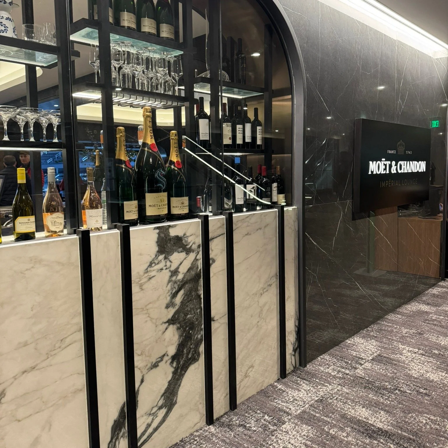
Introducing: Prestigio Onyx & Venistone
Out with the old, in with the new. We’ve added two additional new lines to our ever-growing porcelain tile collection: Prestigio Onyx & Venistone.
Out with the old, in with the new. We’re introducing two additional new lines to our ever-growing porcelain tile collection: Prestigio Onyx & Venistone. Both inspired by the beauty of natural stone with all the benefits of durable porcelain.
Prestigio Onyx
Prestige and glossy sheen are the characteristics that identify Prestigio Onyx, a collection that reinterprets onyx, the most luxurious of natural stones, in a contemporary style. The material is updated through a harmonious language that speaks of sophisticated textures and contemporary shades. The intense link with light and the refined graphics creates environments with a strong aesthetic impact, that at the same time retain an elegant visual lightness.
A contemporary elegance, emphasized by the choice of two surfaces, Soft and Polished, and three modern, delicate shades, ranging from the graceful White to the calming Grey to the warm Beige nuance, with more marked contrasts.
Venistone
Venistone, reproducing to perfection the decisive and iconic graphics of Venetian breccia stone, with an approach to contemporary art, a recall to the design and to the city of Venice, in its most modern meaning.
The patterns are presented with oval and fragmented shapes; moving away from the idea of perspective. The whole visual game suggests a link with the mapping of the city, a look from above, creating fluid, harmonious, multiform architectures.

New Year, New Collections
It’s the start of the new year and we’re introducing several new collections! From stone inspired porcelain to patterned ceramics, there’s something for everyone.
It’s the start of the new year and with it we’re introducing a variety of new collections! From natural stone inspired porcelain to subtly patterned ceramics, there’s something new for all your upcoming projects.

Kado
With a strong decorative impact that rediscovers the charm of old marble grit floors. Offering two different surfaces:
Cement, a stone effect embellished with small inserts
Flakes, a reinterpretation of the classic Terrazzo.
Available in a convenient 24x24 size and 5 beautifully neutral colors.

Cosmo & Magic
Two collections come together in perfect harmony. Cosmo, inspired by the beauty of marble. Magic, offering a charming, neutral palette. Both in a modern, geometric shape.
Use them separately or combine them for a dazzling composition.

WOW Tesserae
Tesserae from WOW is a dialogue between past and future. A classic revolution. Inspired by the hand made cement tiles from the nineteenth century, full of character and recalling the mastery of the mosaic artisans, who composed their designs one piece at the time.
With a matte surface that avoids reflection from light and enhances the endless mosaic patterns at the same time.
From indoor and outdoor flooring to bathrooms & kitchens back splashes, the possibilities are endless with WOW Tesserae.

WOW Texiture
Elegant simplicity.
WOW Texiture ties into a larger vision between patterns and fashion, storytelling apt for endless revisions depending on who it represents.
It is an interesting conversation between design, texture, color and metallic hues. A route into design from a ceramic perspective.

Fall in love with warmth
Fall is officially here! If you’re looking to introduce warmth into your next project, we’re here to help! Read up on all of our favorite tiles for this season.
Fall is officially here! If you’re looking to introduce warmth into your next project, we’re here to help! Keep scrolling to see a few of our favorite tiles for this season. We know you’ll love them too!

First up: Flauti
Our Flauti mosaic tiles offer so many color options with a warm pallet. Our current favorite for the fall is Cotto or Camel Gloss and Satin. Both colors and finishes are beautiful oranges that scream warmth and coziness. If orange isn’t quite what you’re looking for, that’s okay! Flauti also offers Sage Satin, a green tile with warm undertones guaranteed to bring warmth and color into your design without feeling overwhelming.

Next up: St. Tropez
This Mediterranean inspired ceramic tile offers a handcrafted look with bolds colors and distinctive style. Bronce, Coral and Verde are all great options when looking for a warm pallet. Bronce is the perfect chocolate brown for your next project. Not only does this collection have a handmade look, but it also offers tonal variation mixed within each box.

In need of flooring? We suggest a wood inspired porcelain.
Our favorite this season is Logwood Brown. This collection offers all the beauty of natural wood without the maintenance. If you’re looking for a color with deep, rich tones, Brown is a great option.

Our favorite wall and floor option: Clay
The Clay collection is available in a variety of different warm color options. Our favorites for the Fall are hands down Glee and Grace. Both colors are great options when you need to add a splash of color without overwhelming the space.
Last but not least: Microfolia
If you need an accent piece this fall, Microfolia Harvest is a fantastic option. This fun mosaic include every color that makes you think Autumn. From deep browns to bright golds, Harvest is sure to add visual interest to any space you put it in.


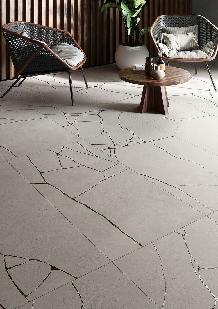
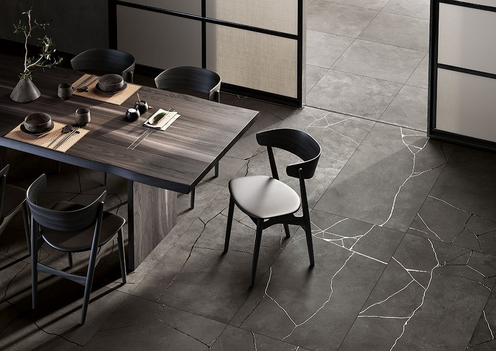
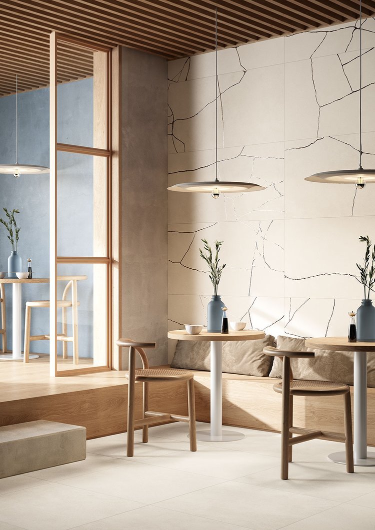
Introducing: Kintsugi
A soft concrete material meets the brilliance and shine of metal in this beautiful porcelain collection

Introducing Kintsugi. Inspired by the art of putting piecing together fragments along connecting lines, giving a new look to the work. A soft concrete material meets the brilliance and shine of metal in this beautiful porcelain collection. Grits and glazes overlap to create luminescent inserts rich in texture and consistency, giving greater depth to surfaces and creating new forms that foster welcoming and unconventional environments.
Creativity, determination and confidence: every experience can be valued and exhibited in a positive way, giving it a unique, precious allure.
Kintsugi is available in four beautifully neutral colors and two convenient sizes.

All About Stripes
Stripes have been a timeless pattern seen in interior design through the ages. It can be easily incorporated in almost any setting: from modern, to contemporary.
A timeless option with endless possibilities.
Stripes have been a timeless pattern seen in interior design through the ages. Its versatile nature can be easily incorporated in almost any setting: from modern, to contemporary or even to ramped up glamour. Not to mention the endless pattern options depending on the orientation of the tile. When arranged in a vertical composition, the ceiling of a room can appear taller, making any room feel automatically bigger. Horizontal patterns can create depth in a room as well as a great visual appeal.
Looking to incorporate a striped pattern into your next project? Browse through the many striped tile options we have to offer here at Statements: from colorful ceramic wall tiles to versatile wall/floor porcelain tiles.
Staff Favorites
Which tiles are we obsessing over this week? We’re loving a nice neutral palette with a splash of elegance thrown in!
Which tiles are our staff favorites this week?
We’re loving a nice neutral palette with a splash of elegance thrown in! If you haven’t taken a moment to explore our selection of porcelain slab countertops.. what are you waiting for?? Our Level collection features a wide variety of color options to choose from. Whether you’re looking for an upscale design or a more casual look, there’s something for everyone. Pair it with a fun patterned or glass tile or keep it simple with a traditional subway tile. (Light fixture from Abbrio Kitchen & Bath)

Pictured:
Level - Tortora Tafu
Florim Slab - Prexious Thunder Nights
AK Immersion - Crystallite Peak White
AK Architetto - Angolo Calacatta
Fort Point - Salty 2.5 x 10 & Flora Wharf

New at Statements: Elegance Pro
Inspired by the natural vein patterns of sandstone, Elegance Pro is a porcelain collection designed with an emphasis on versatility and creativity.
Inspired by the natural vein patterns of sandstone, Elegance Pro is a porcelain collection designed with an emphasis on versatility and creativity. The refined design, conceived and developed using a new production process to more accurately replicate natural stone, distinguishes a collection with infinite architectural potential. Featuring six warm colors that can be mixed and matched to create a sophisticated and versatile color range used to decorate rooms that combine a cozy atmosphere with a minimal, contemporary mood. This collection not only offers a beautiful natural finish, but a Mural finish as well, a three dimensional decor ideal for wall coverings.
Elegance Pro combines versatility, design and functionality, making it the perfect collection to enhance residential locations or complex architectural projects.

Benefits of Porcelain Slab
Thanks to the advanced technology, porcelain offers all of the beauty of natural stone with none of the maintenance issues or usage restrictions.

When you think of countertops and large format slabs, your mind probably immediately jumps to natural stone. Granite, quartz, marble and other natural stones have been around for many years. For so long, these materials have been the go-to for those wanting an upscale look in their home. What many people don’t realize is that there’s a durable, more cost effective option and that option is porcelain. That’s right, porcelain slabs. Thanks to the advanced technology used in the manufacturing of these slabs, porcelain offers all of the beauty of natural stone with none of the maintenance issues or usage restrictions. Keep reading to learn more about the benefits of this modern alternative to quarried stone.

Durability
Porcelain is one of the most dense materials out there. That means your porcelain slab will be stronger and more practical for every day use. This tough material is heat resistant (perfect for induction stoves or heated floors), scratch/chip resistant, chemical resistant and UV resistant (yes, that means you can even use it outdoors!).
Hygienic/Low Maintenance
Because of its low porosity, porcelain is resistant to stains, bacteria, mold and allergens. While sealers are not required, Stain-Proof Porcelain & Quartz Sealer may be applied for an extra layer of protection. A damp cloth, such as a microfiber, is all that is needed for daily cleaning. For regular cleaning, we suggest using a neutral liquid detergent with a soft sponge or microfiber cloth or Stain-Proof Daily Countertop Cleaner.

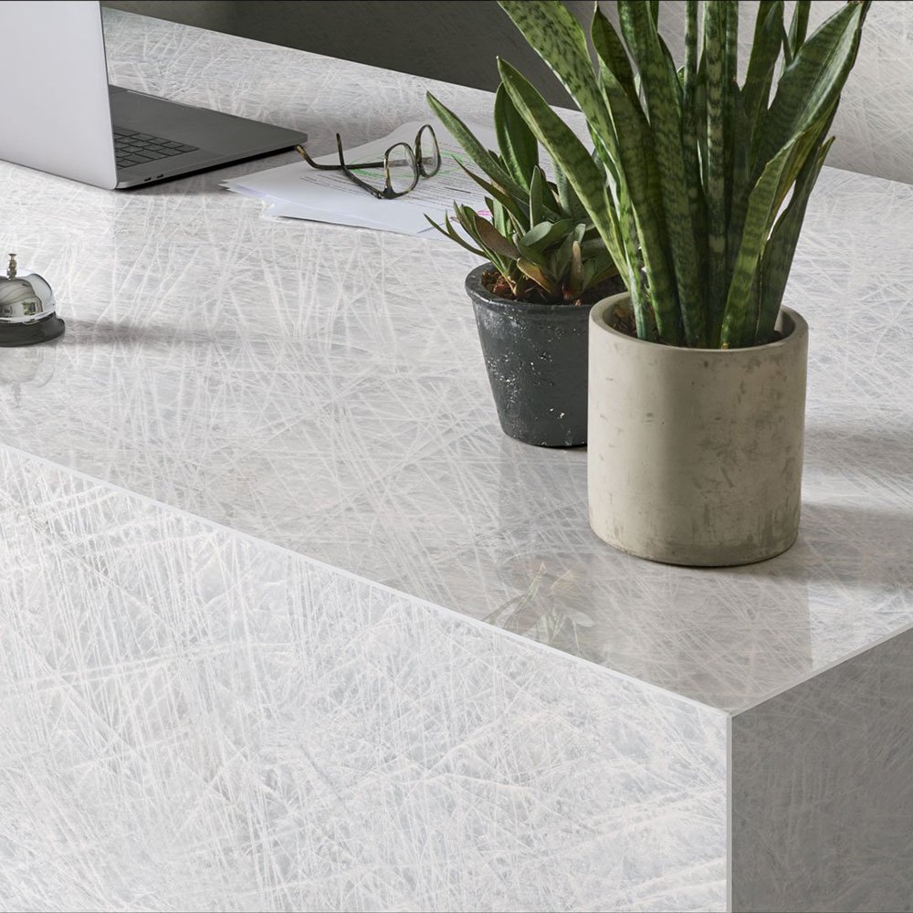
Variety
The technology used to manufacture these slabs is extremely advanced. What does this mean for you? More options, of course! We offer a wide variety of different porcelain slabs. From the highly sought after marble look to neutral concrete looks, we have a slab to fit any project.
Although porcelain slabs are becoming more popular, they are still a newer product, so an experienced fabricator is highly recommended, especially for thin 6mm slab (used for floors and walls). All our 6mm slabs are floor rated, meaning you can get that wonderful seamless look on your floors as well. However, please note that this requires a perfect installation. If there are any air pockets underneath the surface it could lead to cracking over time. This is why an experienced installer is recommended.
Luckily, we are constantly vetting new fabricators/installers and offering training to those eager to learn. We’re more than happy to provide you with a list of fabricators we’ve worked with and trust.
Explore our collection of slabs here or stop by one of our showrooms to see them in person.

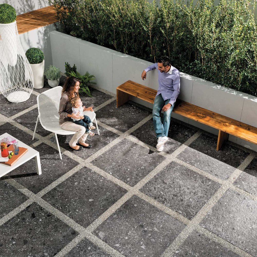
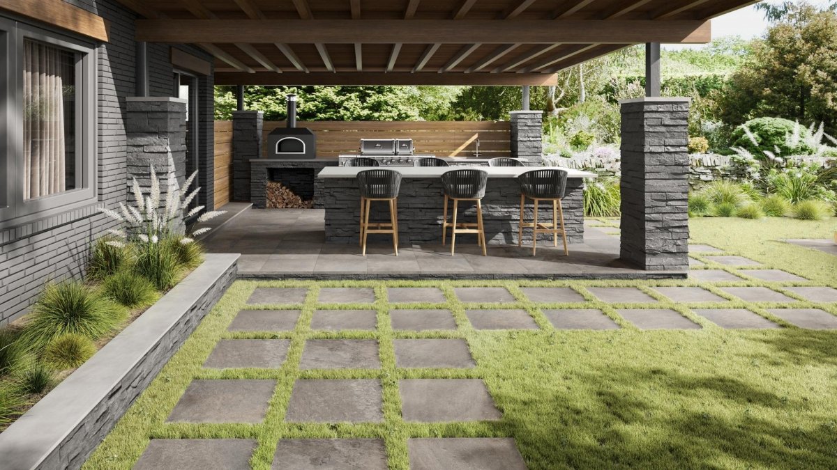
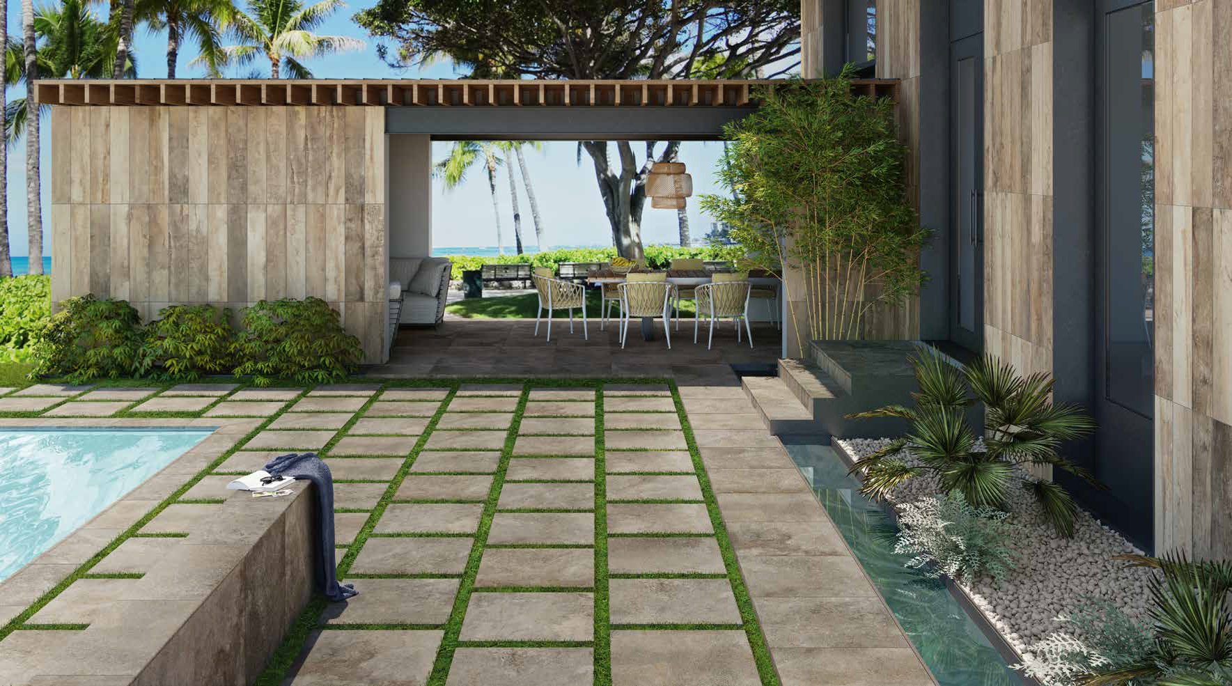
Exterior Porcelain Pavers
Did you know we offer PORCELAIN pavers? That’s right, the low maintenance, high durability material is also a great option for all your outdoor needs.
Spring is here and summer is just around the corner! How are your outdoor projects coming along? Have you chosen your paver yet? Did you know we offer PORCELAIN pavers? That’s right, the low maintenance, high durability material is also a great option for all your outdoor needs. Talk about a versatile material.
Browse the variety of different looks we have available in 20mm pavers and get one step closer to creating the outdoor oasis of your dreams.